|
Paper, Scissor, Board! |
21.Dec.2008 |
|
|
 |
|
|
|
|
|
|
I have been busy the last couple of weeks creating paper board games. I
wanted to try out some game ideas quickly and not spend weeks coding them
and paper seemed like a good choice. I certainly had a lot of fun
testing them out on my friends and I was surprised how tricky it can be to
balance game features even on paper.
It seems the season of gluttony is upon us and I already feel like the size
of a mountain after all the xmas sweets I have consumed from advent calendars
and Christmas trees. Family get together's, large quantities of booze and copious
amounts of food, it must be Christmas time! Happy Christmas everyone and I
hope everyone has a good new year.
|
It seems that physical windows are expensive and it is far
easier nowadays to just paint windows on walls instead!
I found this decal delight while wandering the streets of Rome
on a hot sunny afternoon and I happened to be looking up
... at the wrong angle.
Why they are like this I don't know, maybe the owner felt
the walls were lacking some kind of detail but could not decide on
what to do. Then a friend suggested low poly decal
windows because no one will ever care and at a
distance they look like the real thing anyway!
|
|
|
 |
 |
|
I found this little clay statuette in the Vatican Museum and it
made me laugh when I saw it. This is probably because I have
a dirty mind or maybe because the top part of the statuette is so
damn phallic!
I have seen other early pottery with strange anatomy proportions
like the huge hips, but this one lacked any kind of human head
details and it made me wonder. Did ancient woman find something to
keep her busy on cold winter nights while ancient man was out?
|
One day at work I was chilling out in the kitchen chatting to people
when I noticed something on the front of a box of
vitamin tablets and I could not believe my eyes. They had finally
made tablets for retarded people!
I could not stop laughing, especially as vitamin tablets are
a popular thing to take during winter times to help fight off
colds and flu. I can only assume the manufacturer does not realise
the word mistake on the front of the packet, or maybe they do
and trying to tell us something!
|
|
|

|
|
|
|
|
|
 |
|
|
Roman Reflection |
21.Nov.2008 |
|
|
 |
|
|
|
|
|
|
Here is the final two sets from my Roman holiday pictures which I took way back in August and
unfortunately been struggling to find time to sort out since. The first set is of Roman
Churches
which I thought looked amazing and the second set is a
mixture of places I found while wandering around
the city looking for interesting architectural details.
Back in September a game I was working on called
Warhead
was released and after much anticipation it thankfully got a lot of nice reviews. Eventually I found
some time to sit down, drink lots of tea and write my views on what happened to the
levels I was involved in. I hope you enjoy reading
them and if you have any feedback then please write me a mail.
My website has been using the same graphic headers for some time now and with the release of my latest
work it seemed like a good opportunity to
replace them with something fresh and leafy. I spent a while finding good wide angle shots to use
and I also wanted to keep all the various
quotes
from Lewis Carroll,
as I really liked his quaint British humour.
Recently I went to a Jean Michel Jarre
concert
in Budapest and being a fan of his work since
I was child, it was like a trip down memory lane. The stage was full of old
analogue
synthesizers and I remember owning one myself many years ago. The ability to play with the sound
via dials was fantastic, but the sound use to change a little bit after the synth had warmed up, which
was the charm of owning one.
|
 |
|
Rome seems to be the capital of churches
with almost every street having some place away from
the bustle of the cobbles to pause and reflect. Every church has its own character and style
and varies from simple white marble to the most elaborate use of gold.
The pinnacle of grandiose church design has got to be
St. Peter's Basilica
located inside of the Vatican City. There is nothing quiet like it in
scale and architectural
beauty and it has got to be seen to be believed.
|
A mixed collection
of pictures taken while walking around Rome looking
for something different that the usual stuff in the guidebook.
I was looking for how the city has changed so much over time and what
the people have added and moved around to suit their needs.
Each picture is accompanied with a few brief words on what I found
interesting about the location and why I stopped to look. Being
very much a shape
and line
person a lot of these images are leaning
more towards architecture and building details than holiday snaps.
|
|
|
 |
 |
|
Once again my strange fascination with funny shop names found time in Rome
to snap a few picture and this gold nugget of literal comedy had me in stitches.
I know it is not the
exact
spelling but it is still
valid
nevertheless.
When I saw this sign I had the mental image of a huge number of
gipsy caravans
traveling between all major cities in Europe and for a small fee, this travel agent
will sell special trips aboard the caravan express! Ok it is a silly idea, but
it had me amused everytime I walked past the shop.
|
Oh wow this was priceless, I could not believe my luck, I had to get
a picture of this before I woke up and realised it was all a wacky
dream. A Sore Shoe shop, it is like owning a sweet shop and calling
it 'The Rotten Tooth'.
What made this even more entertaining was that my girlfriend saw
the shop and wanted to check it out. The shop was shut the first time
we saw it, but was open the next day and now she owns a pair of
sore shoes. The joke
'I bet those are sore shoes' never gets old!
|
|
|

|
|
|
|
|
|
 |
|
|
Snappy Holiday |
9.Oct.2008 |
|
|
 |
|
|
|
|
|
|
Back in August I went on holiday to Rome and even thou the weather was crazy hot
I still got a chance to see around the city and check out all the different
sights. While I was there I took a ton of pictures (like I usually do)
and the first three albums are linked below.
Recently I released a Q3 map called
Mystic Gemini which I
developing during sleepless nights. The map got reviewed at
..::Lvl and I got the impression
that the reviewer did not like the map, which is a shame.
All of the
source materials
for the map have been released for free, so if you want to have a peek at how it was made
check out the source
page.
|
 |
|
In the Vatican Museum
was an exhibition on Chinese culture with a pair of
Guardian lions
at the front entrance. Usually these kind of statues are constructed from solid
stone, but the museum had a pair made from fine metal and exquisite paints instead.
The lions were in perfect condition and the level of detail was breath taking
considering how old these statues must of been. Luckily for me and my girlfriend the exhibition
stayed open long enough for us to look around.
|
In the Vatican Museum
besides the central courtyard
was a huge display of Roman antiques. The initial corridor was covered from top to bottom in
shelving featuring a sea of different types of roman busts.
At the far end was a doorway leading
to the Braccio Nuovo gallery built by Raphael Stern featuring the
Augustus of Prima Porta
statue. The collection was incredibly diverse and the quality was remarkable considering
how old these statues were.
|
|
|
 |
 |
|
While wandering around the back streets of Rome, I found a lot of doors
that looked so different. With so much variety
about I thought it would be cool to create a small collection of images
showing some of the styles I found.
The doors were all made from similar materials,
but each door had a unique shape and style which is so often missing from
modern day buildings. I am sure most people think am I crazy for taking the
pictures but they all looked so unique and cool.
|
I found this little gem in a sweet shop while wandering around
the narrow streets of Rome trying to escape the burning hot sun.
I was surprised to find this lick stick considering that it has a picture
of the current pope on the front.
In typical Carry On
humour the lol-e-pope turned into "Could you lick my pope?" or "Oh my pope feels sweet
and sticky tonight!". I assume the Pope does not know about this but
If he does I would recommend his next product be a
hard stick of rock,
I hear they are good for licking as well!
|
|
|
 |
|
|
|
|
|
 |
|
|
 |
|
|
|
|
|
|
Mystic Gemini was released a couple of days
ago and after months of working on it someone found a
location
where you can rocket jump from one base to the next. Unfortunately this was not found during
testing and it made the release a bit of a disappointment to me. Hopefully
next time I will be able to catch these kind of bugs earlier.
A while back I posted a picture
of a building perched on top of another and thought it looked crazy. Well a couple of days
ago someone mailed me and said 'the 2nd building is there because of restoration of the
figure on it :D'. It makes perfect sense to me and it is pretty cool that someone
found the time to tell me. Thank you, that made my day. :D
|
 |
|
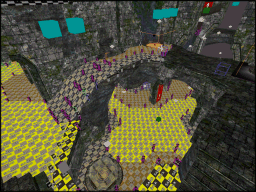
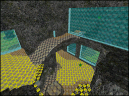
The source files for Mystic Gemini
contains most of the original map files saved at various stages throughout
the project. The older maps will contain broken shaders as stuff was moved
around, there is no fix for this.
An explanation of when the maps were used in the project
can be found on the source files
page. The maps are supplied as it and probably contain the odd mistake
or two. Please bear this in mind when going through them in the editor.
|
The zip file contains most of the editor textures that were
used to make the map easy to understand in the editor. These
files were not necessary to distribute with the final release.
I have included all the special bot maps that were used throughout
the project. The bot file was split off from the main towards the
end and unfortunately due to game play changes went through
several versions.
The source files
page also contains details on all batch files used to compile the
maps.
|
|
|
 |
 |
|
Now that is a direct message to all potential customers
walking past, please shop! I am not sure if this is a
chain of shops or just the odd one trying to do something
different.
The sign underneath roughly means in Hungarian 'Drugstore',
where you can get bathroom type products. The sign is
certainly catchy to the eye and made me smile when I saw it.
Now all they need is someone standing outside the shop,
pleading with customers to come in! :P
|
I saw this shop sign while going home on
the tram from work at night. The title is certainly
catchy and I can imagine some wacky game show centred
around it. You got 30 seconds to buy the right item ...
or die!
It is certainly ironic the shop died and a bit sad
the shop name was so relevant to the way it all
ended. Not even sure what stuff they sold, the shop
was closed down time I got round to finding it
during daylight hours.
|
|
|
 |
|
|
|
|
|
 |
|
|
Mystic Release |
09.Aug.2008 |
|
|
 |
|
|
|
|
|
|
I always wanted to create a CTF map based on my last
texture set,
but I could not find a layout which I was happy with. Back in January this year
I was browsing lvlworld and I found a gorgeous
CTF map with cool features which I thought would look good in stone ...
|
 |
|
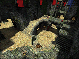
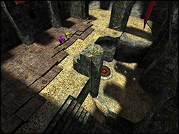
Mystic Gemini
started life as a lump of rock covered in ley lines which I cut up
into small shapes and rearranged into pretty patterns. After hundreds of lunch breaks
and the consumption of a mountain of
home made cake, my latest map is ready for release.
Made from huge piles of rock, sand and green leaves the map was designed to feel
like an ancient place abandoned many years ago. The layout was based on a map called
Evil Gemini
by Mr. Lake and includes new routes, item changes and a large quantity of bricks.
|
What started out as something to keep me busy during the dark
winter nights, turned into a cozy trip down memory lane.
Like an old jumper that you have had for years, level design for Q3 is
just cozy and familiar to use.
During the development of the map I received a lot of feedback
from many friends and this was the highlight of the
project for me. Eventually the map changed into something much better than I
could have produced on my own and I hope everyone enjoys playing the
map as much as I had fun creating it.
|
|
|
 |
 |
|
Perched high above an Irish theme pub and next to a very cool
coffee shop is a cat with wings. OMG ... CATS can FLY !
I remember seeing this cat many years ago while exploring the city and thought
it was very cool. Recently I went to a gorgeous Spanish restaurant across the
road from the pub and found the flying cat again.
Walking out from the pub late at night, looking up and seeing that cat must be
priceless, especially if you are drunk! :P
|
I spend large amounts of my time making, playing and talking
about games that I often see stuff while walking around, which
remind me of things in computer games.
At work there is a nice garden area with water, trees and
a path around the outside. It is a really nice place to go
and eat lunch, soak up sunrays and get away from the office cave.
Recently the water turned a deep green colour because of algae problems
and when I saw it for the first time, I thought it
looked like a toxic green slime pool!
|
|
|
 |
|
|
|
|
|
 |
|
|
World of Bots |
18.June.2008 |
|
|
 |
|
|
|
|
|
|
I very rarely get free time nowadays but when I do, I just want to relax and play games instead of
doing my own projects. This relaxed groove is hard to break because I know
I need to finish my Q3 map project soonly. Most of the creative fun stuff has been done already
and there is a lot of technical stuff left to do which does not inspire me to open the editor at the moment!
At the start of the project I did a lot of tests to see if the alpha layout would
produce a good bot file and I assumed it would work fine at the end as well.
Since then I have been creating whole map bot compiles with no optimizations and things
have got messy. With the map structure complete, I can finally branch off to a
separate map for the bots ... now the fun starts.
|
 |
|
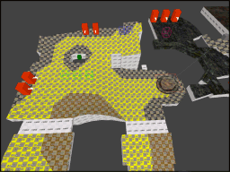
The only part of the original map I wanted to start with was the floor. This is the
primary surface for the bots and it had to be as close as possible to the human version.
I removed all the walls and upper details and then simplified some
of the floor edges because I wanted the new wall structure to be as basic as possible.
I converted all of the floor brushes to structural and worked through a long list of
leaks to make sure the map would compile again.
|
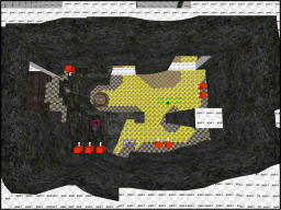
Once the floor was finished I created a simple set of wall brushes that
went from the floor straight up to the skybox. I followed the floor shape to
a certain degree but certainly not to the same level of detail as the original.
All of the connecting corridor ceilings were reduced to flat surfaces and the
organic rock structures in the central area were converted into very blocky
brushes instead. This was done in preparation for the bot cluster portals
which required clean surface frames.
|
|
|
 |
 |
|
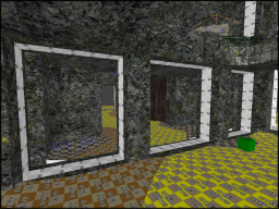
Bot cluster portals should have clean surrounding brushwork to be reliable.
Any extra brushwork touching the portal surface can cause splits and
this can increase the chance of the portal being broken.
I assumed that the bot file was an exclusive space for the bots to move around in but this is
not the case. Bots will not sink though the floor if the bot file has a lower floor.
With a flat lower floor space I can force the bot portals to be exactly where I want
them, everytime I compile the map.
|
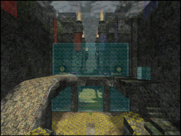
With the bot file created from a separate map and then linked back to the original
BSP the AAS file got reduced from 14Mb to 1.7Mb!
The AAS file ended up being split evenly into 7 well sized clusters and after
a lot of testing the bots flowed around the map extremely well.
I am not sure how many people actually play CTF style maps with bots nowadays but at
least everyone has the option and all the work I did hopefully will pay off with
someone enjoying a game with bots.
|
|
|
 |
 |
|
Outside a local gun shop is a pirate scaling the building like something from the
Crimson Permanent Assurance
company. This was something I spotted a while back but due to road works I have not been down that street
in a long time.
The pirate hanging off the wall was the first thing I noticed about the shop,
but I always have a habit of looking up to see what the roof line looks like.
The opposite side of the road has a really good food market located in a very cool looking building.
|
While walking around Budapest this weekend I found a very funny shop in a small side street.
The shop name is just priceless, a doctor who looks after bushes, down under!
Even after all my cheap attempts at humour, the shop does indeed sell
equipment and advice on how to keep your bush trim and healthy! (It still makes me grin when
I think about the name) If only the shop keeper was Australian, now that would have been the
icing on the cake for me!
|
|
|

|
|
|
|
|
|
 |
|
|
 |
|
|
|
|
|
|
The weather is hot and it is time to venture out from my cave at the weekends
and see the sights of Budapest. I have been planning to take some more pictures
and the good weather is a perfect opportunity for me to wear my summer shorts and
scare the locals.
|
 |
|
Last year I took a quick weekend trip to Vienna (3-4hrs by car) with my girlfriend
to see the sights. The weather was very dry and cold but the hotel
was amazing as we got upgraded to a larger room.
While out and about in the city we were admiring the really cool sights when I spotted
this building perched on top of a corner of another building. I am still not sure what
to make of it as it looks totally stupid, but it certainly made me stop and stare!
|
When I first saw this sign from a distance I could not understand
what was wrong but something did not feel right. The sign seemed to have
depth from a distance but I knew it could not be true as the majority
of street adverts are 2D images.
I had to find out what the sign looked like close up and when
I discovered the extra bits coming out from the flat surface it made me smile.
Finally a sign that used more space to create depth to the image, a damn
cool idea, hopefully will see more.
|
|
|

|
 |
|
On my way to work everyday I pass the
Museum of Applied Arts.
A brightly coloured building covered in ornate architectural details, surrounded by a sea
of generic grey buildings in front of a busy wide road of constant traffic.
When I first saw this building I thought it was a church due to its highly decorated roof
design, imposing central dome, arch windows and various wall column supports.
The building has an eastern style which effortlessly fit together to
create a mesmerising appearance.
|
|
|
|
|
|
 |
|
|
 |
|
|
|
|
|
|
I was planning to make an update of my site every month about something I thought was funny
and worth sharing, but that plan seems to have gone wrong. I could have sworn that only one
month had pasted but it has not and I don't know where the time has gone either!
I know I have been working crazy long hours lately but did not realise things were going past
so fast. Maybe it is living in a city where everything is changing so quickly that the speed
of time does not seem so apparent anymore.
Every now and then I change my route to work to see if I can find anything new and different
to take pictures of. The rich source of different building designs is amazing and maybe
soon I can find some time to do a small series of photo collections on my favourites.
|
 |
|
Tucked away down a small side street is a little shop, where you can buy the police!
I assume this has nothing to do with the real police but when I saw the sign I could not stop
laughing at the play on words. Maybe it is a place for the police to go shopping for new
accessories to help them fight crime.
I assume from the logo this is a Private Investigator or something similar with a
Sherlock Holmes icon.
|
I have been walking past this traffic light for months and never noticed what was different
about it. The first time I saw the smiley face on the yellow light, I smiled back!
Now that I know the smiley face is there I often see it every day and smile. A simple
idea but one that is clever enough to make a difference and cheer people up while going to work.
|
|
|

|
 |
|
Building front renovation is often messy and can cause a lot of dust and rubbish to spew out
onto the streets. To prevent this problem, big covers are often put across the front of the scaffolding
to minimize the mess.
The new building fronts are usually decorated with huge adverts but sometimes they are covered with artistic
drawings instead. I can understand that marketing people
want to paint the whole world with adverts but this new trend of outline drawings is very cool.
I hope more building developers take note of this idea and don't insist on more dumb adverts trying to
convince me to consume more stuff. More art, less adverts!
|
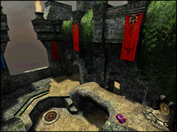
My new Quake 3 map Mystic Gemini is still ongoing
but at a very slow speed. With my current job demanding more time and extended crunch hours
my lunch breaks are getting smaller everyday.
With all the level architecture finished I can finally start on the bot optimizations phase.
I plan to make a separate special map for the bot's instead and then merge it together
with the player map at the end.
|
|
|
|
|
|
|
|
|
 |
|
|
Street Walker |
30.Mar.2008 |
|
|
 |
|
|
|
|
|
|
While walking to work every day I always have plenty of time to look around and see what is going on. Back in January I
took a couple of photo's of various things on my walking route that I thought was funny and worth sharing. I was going
to include these pictures in with a proper website update but my other projects I am working on are not going according
to plan and everything has been delayed.
I spent most of January and February working on my game Flipper trying to further
optimise the program so that it can run on more systems. After converted all the assets from 3D to 2D, adding effects
and optimising the menu's I finally came to the conclusion that the game looked terrible.
Without any art direction, Flipper
had turned into a horrible mess of every colour possible on the screen at once. The game seriously needs an
art theme and the main tiles seemed like a good place to start. I planned out what I wanted to do and how it would
look but unfortunately work got crazy (with my time). All my free time evaporated and everything ground to halt.
During my lunch breaks I love to visit ..::Lvl and see what maps are being downloaded.
The website has an amazing layout and I recently spotted one of my favourite maps in the list. I gave it blast with some
bot's and decided I wanted to make my own version. I contacted the original author and luckily got the go ahead,
so now I working on a new Q3 map ... again.
I have been using my lunch breaks to relax with the GTK editor and mapping has been coming along really well with
several alpha's and a couple of art tests. Unfortunately there was one thing I over looked ... small mapping sessions
produce very slow progress!
|
 |
|
While wandering to work one day I noticed a street sign above a girl's clothes shop. I did not pay much attention
at first but then I noticed the girl on the right, it was the main character from
NOLF!
I loved playing NOLF and had loads of fun listening to all the dialog of the
game. What I found cool about this sign is how computer games characters are being accepted into the main stream of
every day culture.
|
Stuck to the side of a wall above a street bar is a huge neon lit sign of a penguin holding a beer.
The sign brightly lit at night (lots of late nights walking home) is very cool to see and I love
how some places take the extra time and effort to create a sign that is cool and different.
For some geeky reason this street sign reminds me of the Linux symbol,
the giant penguin.
|
|
|

|
 |
|
I found this sign outside of a building where you can hire a hall for family/official functions. It probably good
for wedding receptions and various other types of celebrations. Unfortunately
for the owner and very funny for me, the name of the place is priceless, the TIT studio.
This sign reminded me of the van
in Only
fools and horses and Trotters Independent Traders painted down the side. Sadly TIT means nothing in Hungarian
so people wonder why I'm grinning and laughing to myself when I walk past this place.
|
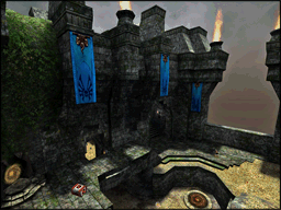
I suppose I should finish this update on something relevant to my site. Here is a very early screenshot
of my latest Q3 map which at the speed I am creating it at, maybe finished sometime next year!
It is a small 3v3 CTF map with a very organic/rock art theme. (mostly borrowed from my previous
POM map) There is something really relaxing about mapping for Q3
and it is probably the fact that it is very simple. Most modern game engines are so damn complex
that the creative fun has been squeezed out!
|
|
|
|
|
|
|
|
|
 |
|
|
 |
|
|
|
|
|
 |
|
One thing which has been bothering me for sometime is the performance of my game.
This was further highlighted by a couple of people during feedback that said the start-up
of the game had extremely low FPS and was unplayable.
Initially when I looked at the problem I thought the FPS issue was due to something
not finishing on time at the start of the game and causing the slow down with FPS.
The start-up scripts were split between a common ⁄ mod directory and there was not
much documentation to help with what everything did. Eventually I got the scripts down to
their bare essentials, but this did not fix the FPS problem.
|
|
When I first started playing with the engine I found out very early on that it could cope with
3D assets. Which was very good news because I can create 3D assets much easier than I can create
2D assets. What I did not know at the time was, the engine was very good at pushing large
amounts of 2D assets but not good with the same amount of 3D assets.
My initial tests of the engine were just a couple of models to see if I could get the 3D importer
working correctly and the FPS was just fine. As the game started to grow so did the amount of 3D
assets I was using which included coloured tiles, shadow models, special tiles and highlights.
All these 3D assets were really hurting the FPS and I needed to find a way to convert some of
them back to 2D assets.
|
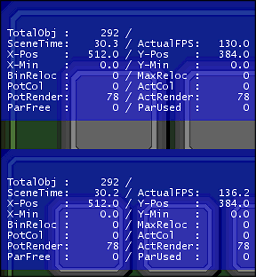
The first logical choice for asset replacement was the main tile grid as it was drawn all the
time and made up of two 3D assets, tile & shadow. I took a couple of screenshots of what
the performance was like beforehand so I could tell if anything had changed.
In order to convert the 3D assets into 2D assets I used the engine to do the hard work for me.
I setup a grid of grey tile in various rotation angles and took a screenshot which
I used to create a 32 cell animation stripe.
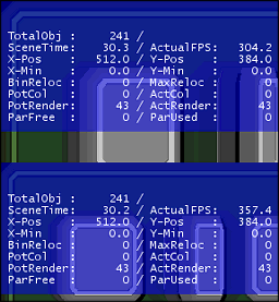
Once the 2D asset data blocks were setup I replaced the front menu 3D tiles with a complete
grid full of looped animated tiles and checked the FPS speeds. I was amazed and relieved that
I had found a way to speed up the game without any difference in appearance.
|
|
|
|
|
Last week I was busy creating some new web pages when I found various HTML tag errors in the template I was using.
Normally I am not too bothered by this because usually the browser compensates but I knew if I did
not fix this problem soon, it would get worse.
The only problem was I did not know how much of my website was affected by these tag errors so I decided to use
the W3 Organisation to help. The program did its job perfectly and found
a lot of errors on over 50% of my website. This was going to take a long time to fix but it was also a perfect
opportunity for me to fix the various Javascript errors I had but was too lazy to fix.
After a lot of research into different ways of creating HTML tags inside of Javascript I eventually found a really
cool utility which converts HTML tags into
browser friendly javascript tags. With all my errors fixed on my first web page I finally got myself a new reward,
a new icon!

Wow ... I have a brand new icon which I could put on my website to say I was crazy about my HTML! Yes! There
was no stopping me, I was on a mission to clean up my sloppy browser compensated HTML and save my webspace
from a certain invalid tag meltdown.
Several hours later after extensive eye bleeding from staring at HTML tag code I think it was done ... but I am not 100%
sure because I blacked out and woke up with a qwerty face. Still not sure why I did it? Please let me know if you know
the answer to this madness...
Dusty corner decal
Sims
|
|
|
|
|
|
 |
|
|
 |
|
|
|
|
|
 |
|
With all my data spread out over various pencards, cdroms and paper I finally found the
time to merged it all together and produced something useful with it, for my game.
Arrh yes my game, I was sure when I started out this project it was going to be a quickie!
Something for me to do in my spare time, give me a bit of focus and insight
into how a complete game could be made from scratch. It is still lingering and I have even
produced a couple more updates for it!
|
|
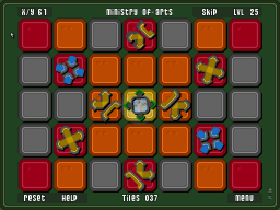
The first release of the game did not really go as expected, I assumed a lot more people
would like it because ... it was cool. Unfortunately I did not realise that every man,
and their dog has produced a puzzle game! it seems to be on that list of 100 things
to do before you die.
I was not really prepared for the lack of responses, I some how expected more but it raised
an interesting question, 'Where do you go to get feedback on casual games?' I am
still wondering about this question and where on the internet a group is lurking for this
type of digital content.
While I was without a PC of my own I decided to do some testing of my game. The initially
feedback I had was very critical of the interface and I needed to know how to fix it. Luckily for me
(maybe not for my work friends) I knew a lot of people at work who had not played my game
and it was a perfect opportunity for fresh 'observed' feedback.
|
I installed the game, ran the icon and then handed the controls over to my friends.
No other help was provided from me, besides letting them know what I was up too.
With my notebook open and ready, I knew I should have worn a lab coat!
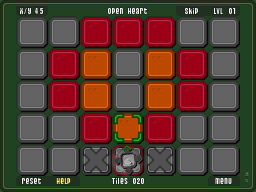
I assumed the game would be easy to pick up and use ... it was not. Most people
struggled with the first level because there was no feedback from the game, there was
no help available when the player wanted it.
|
|
|
 |
|
The feedback showed me something very interesting about the way people explore and play
games. Flipper did have some help but it was presented wrong, everyone just dismissed it and
tried to play the game! I know that sounds like a crazy idea but people wanted to learn by
themselves. The help system should of appeared when they wanted help not before.
The self-learning route seemed like the best way to go with the game, so I decided to
try and create a Passive Help System.
This did involve a lot of testing and each time I needed to check what the changes were
like, I had to find a new person to test it with.
Eventually after a lot of testing and suggestions from everyone the help system started
to take shape. After all the work I did I think the game is a lot
better and (best of all) easier to get into, which should be the primary goal of any game.
|
 |
|
After months of trying to order a laptop from Dell I finally gave up and bought a laptop
from IBM. Trying to get PC equipment delivered to unusual locations is not easy
and after all my problems I would highly recommend, buy local.
It is strange how a certain brand name can conjure up stereo typical images in
your mind. Maybe it is my age or something but I actually like my laptop. I know it is not the
latest / greatest laptop but it looks cool to me and I was assured from all the marketing
spew that it is a reliable solid product.
|
|
In that one statement 'it is a reliable solid product' I think I have admitted
that I am getting old. For some reason the sparkle of the latest gadget does not bother
me anymore, I actually think about 'How long is this going to last?'
Fingers crossed my laptop does not go up in flames and I end up in some internet cafe
typing long strings of expletives to everyone under the sun!
Grumpy Old Man
Sims
|
|
|
|
|
|
 |
|
|
|


