|
Flipper 1.5 - User Interface |
 |
|
|
|
 |
|
| |
|
|

|
|
All use of this game is covered by this
Creative Commons Deed.
Please do not use this game for any commercial purposes, thank you. |
|
|
The game was originally developed for me and a couple of friends and everyone knew where everything was
on the interface. There was no real confusion of what to do or where to find things, we all just knew.
The user interface grew gradually over time and in no pre-planned direction and that was the root of the
problem.
When I finally released the game (v1.0) it was confusing, people really struggled to even start the game
and if someone was lucky to find the first level, the learning curve just went up, vertically! I then
realised that I had talked all my friends through the game so there was no learning curve, I needed to
see for myself what was going wrong.
After watching a lot of new people test the game I found that a pattern was forming, people were getting
stuck with the same things over and over again. Sure there were a couple of people who did some stuff
different but the majority failed at the same points. I realised that if I did not change the interface people
would not play the game and luckily after all the testing I knew what to fix to make the game easier to understand.
|
|
| Information Overload
|
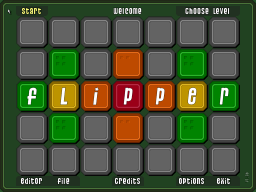
The first problem was there was simply too much information all at once. The very first screen
to the game was cluttered with too many buttons and things to do.
To solve this problem the menus were split up into simple and advanced categories. The extra
functionality like the editor was hidden, so if someone was really interested they can find
it later.
|
|
| List of Levels
|
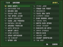
To move between levels the user had to click on some text in the top right hand corner of the
screen. This would change to a couple of arrows, a level number and some Y ⁄ N text.
This was fine in the early days because all levels were referred to by numbers. The level name
did not exist so it did not matter. When finally level names did exist, they were located
under the file menu.
|
|
|
|
|
The level name list was an extremely useful idea but it was located in the wrong location. The original
method for changing levels was terrible and had to be replaced. Luckily the level name system already
existed, it was just a matter of copy and paste.
The final problem was that no one could find the level list feature, the button text was not
obvious what it did. Some people even used the skip button on the game screen to move between
levels because they could not find any other method.
After the label was changed the level list finally became a useful feature and also showed everyone
how much of the game actually existed. I always wanted everyone to be able to pick and choose what
level they wanted to play and this features helped to fulfil this goal perfectly.
|
|
|
|
| I want to play now!
|
I assumed that if I show a help screen with instructions of what to do that everyone would
stop and read it, wow I was so wrong.
Most people just clicked the tutorial screen away eager to play the game. The rolling demo
showing how to play and the bullet text I had crafted to highlight key features of the game
was gone!
|
|
|
With the tutorial screen dismissed and no way to get back, everyone tried to use the game without
any help. I sat quietly next to each game test person while they wildly clicked
all over the screen (sometimes the same spot over and over) trying to understand what to do next.
Afterwards I asked everyone why they clicked madly everywhere and an interesting thing happened ...
nobody realised where to start. Everyone was expecting something familiar, an object on the screen
they could relate to as a starting point.
With no background story or central character the player focus was missing so I decided to change
the cursor to something more robust. I changed the graphic, added a gentle sway ⁄ bobbing movement
and some background effects to attract the eye.
The next problem was that the player did not know where to go next on the screen. Everyone just
wildly clicked the mouse cursor all over the screen hoping for something to happen. It was funny to
watch but it also showed me a good place to start giving the player hints.
|
|
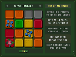
| Special Help
|
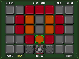
Early on in development I came up with the idea of giving additional help by hovering
the cursor over special tiles. A set of white highlight squares would appear and
show what area of the grid the special tile affected.
Even thou this was a good idea, no one really understood the feature and often it was
discovered by accident which added to the confusion. With better presentation to the player
this idea could be useful in other ways.
|
|
|
|
|
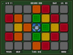
The highlight idea worked well because it was a passive help system that could easily be applied
to the player start point as well. If the player click somewhere they could not go,
this system could gently remind them where they could go instead.
The first prototype was big bold colours of red and green around the player icon showing where
the player could and could not go. This was more of a shock than a subtle reminder because it
often showed more red than green. The large quantity of additional colour to the screen
was counter productive and distracting.
The next prototype was to remove the diagonal highlights and change the red to grey so the only
colour was the green of where the player could go. The less colour and highlights was a better
balance of subtle and helpful.
The final prototype was to dynamically change the player icon to show at all times where
the player could go. This enforced the green highlights idea and also gave the player a direction
to go. The last step was to fine tune when the highlight system would be active so to be helpful
early on and very passive in later levels.
|
|
|
|
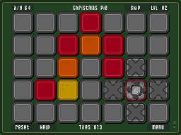
| Reset Button
|
During the testing of the game a couple of people got stuck and did not know
what to do next. I assumed they would use the reset button and try again, but they
did not.
One person just clicked all over the screen waiting for something to happen and another
played with the random rotating grey tiles hoping they would change colour.
|
|
|
I did not want to tell the player that the level ⁄ game was over I just wanted them
to use the reset button and try again. My first attempt at helping the player when stuck
was to flash the reset button until the level was reset. I felt that this was enough, a subtle way
of explaining what to do.
|
|
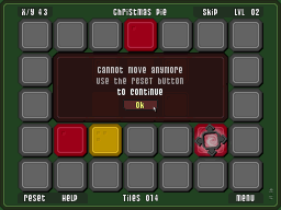
| Final Reminder
|
Sadly the flashing icon did not work as some people just stared at the screen and
ignored the reset button. It was still too confusing and not precise enough of what
to do next.
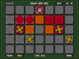
So I opted to remind player once with a big red box on the screen instead and it worked
perfectly. Everyone understood that when they are stuck, use the reset button.
|
|
|
|
|
|
| I see Dots!
|
Very early on development a friend asked me to included a legend on the screen showing
how many times the coloured tiles turned, before reaching grey.
I really liked the idea but could not find a good subtle way of presenting it. I tried various
ideas but nothing really felt right, so I created a legend down the side of the screen.
|
|
|
After releasing the game (v1.0) someone suggested the idea of numbering the tiles
instead of the legend down the side. I instantly liked the idea because it was subtle
and something that could be worked into the art style of the game easily.
I played with the idea of dice dots on the tiles but it was too unsubtle so I eventually
settled for a corner configuration that was discrete but informative. I asked a couple of
friends about the dots and if they noticed them or not and everyone said no, they missed them.
Oh well, such as life.
|
|
| Where is the Extra Help?
|
The game originally forced the player to see the new tutorial screens every 3 levels. Once the
tutorial had been viewed once, it was disabled and not accessible again.
The text which was displayed on the tutorial screen's concentrated on too many fine details and
did not really talk about 'What does someone need to play the game'.
|
|
|
|
|
The tutorial screen text was re-written to be more understandable and hopefully more relevant to what
a new players needs to play the game. The new text follows a more consistent style across all screens so
that the information can be understood quicker.
When each tutorial screen is unlocked (every 3 levels) the player can now go back to previous
screens by using the new arrow keys at the top of every screen.
The help button remains on the screen all the time with every level and is coloured coded
yellow if there is new information available. If the cursor hovers over something new and
there is new help available then the help button will flash to remind the player.
The tutorial screens are now just one more part of the overall passive help system and interface to
the game. After several weeks of testing the game with new people and adapting the game
to the feedback I received I believe the game has become a much better experience.
|
|
|
|
|
|
|
 |
|
|
|


)
)
)
)
)
)
)
)
