|
I have always loved the sight of old places with their weathered bricks, cracked plaster and wind chewed wood.
A picture of something old feels mysterious, like it wants to be explored. Luckily for me I got the chance
to wander around Italy taking pictures of
crazily detailed
frescos and
beautifully made marble
facades.
At the end of the trip I had 60Gb of digital pictures and I knew I wanted to create a new texture set
infused with the feeling of the Renaissance.
|
|
|
|
|
|
|
|
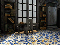
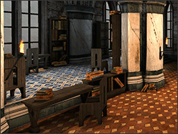
One of my favourite designs in the new set texture is the blue floor tile from the
Piccolomini Library inside of the
Siena Cathedral. The diamond
tile design is so unique and the crescent moon symbol in the middle is simply the icing on the
Cake.
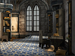
With the source of the floor tile being a library it seemed the logical choice to create a scene
with tall ceilings, large column and lots of books.
While in Rome I had the chance to visit the
Santa Maria Dell'Anima
which is a tiny church off the beaten tourist track, but it has one amazing feature, an unusual roof support design.
The large columns inside of the church are extremely tall like tree trunks and the beautifully decorated vaulted ceiling is
sprouting
from the top like a golden canopy sheltering the congregation far below.
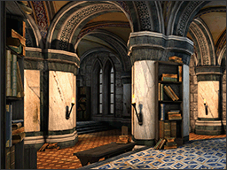
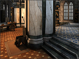
I really liked the idea of the organic roof, so I used a
Greek cross shaped column instead,
with the top flared outwards to create the impression of the vaulted ceiling growing from the centre.
|
|
|
|
|
|
|
|
Initially I split the room into several height elevations so that the different floor tile designs
could have well defined borders. Next I added the supporting columns as boundary poles between the
different areas of the room and connected the sides with angled staircases. With the beautiful floor
tiles taking up much of the colour palette the rest of room did not need to be so detailed and large
blocks of white marble and stone were used on the walls to counter balance.
Luckily one of my previous maps The Edge of Forever
featured an over abundance of bookshelves which were easy to re-arrange and adapt to the new room
layout. Some objects had to be created from scratch (chairs and tables) and google image search
helped with the reference of medieval designs. The final touch was a full decal pass with dirt around
most of the column / wall borders and large amounts of dusty cobwebs covering most of the nooks
and crannies.
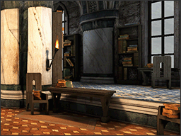
The lighting of the room was designed to be contrasting temperatures, with a cool sky blue by the
side windows and hot orange
torch light in the middle. The initial setup did not have enough of an impact and all of the torch lights
had to be increased to create a stronger glow effect. This worked really well with the white marble because
it was easier to over bright the surface.
|
|
|
|
|
|
|
|
This concept map uses higher density textures
and external light maps to create a big impact for the visuals. Unfortunately the map
object (bookcases and torches) textures were old and had to be rebuilt from new sources, because not
all of the originals were available anymore. This created a
domino effect with the
objects because the old textures next to higher resolutions exposed cracks in their
design. This was especially bad with the torches which had to be rebuilt from scratch.
What surprised me the most was the trouble with the external light maps, they did not support the hot
glow effect and the marble behind all of the torches was dull. This led to some parts of the map
needing different lighting models to cope with the visual effects and some weird problems with light
across seams. For some reason the external maps had strange jagged lines and had to be manually fixed
in Photoshop which took a while because of several compiles.
After much Photoshop editing of the light map (which is a cool feature) and all of the texture upgrades
the new library scene is finally complete again. The jagged lines are gone, the torch glow is back
and the textures look crisp and sexy in super dooper high resolution.
|
|
|
|


