|
 |
| |
|
|
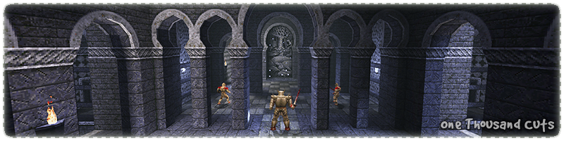
This map is my homage to a classic texture set, a beautifully cold and chilling colour palette that
I encountered many years ago and still fondly remember like it was yesterday. This map is an
overly complex entity experiment that went in all the wrong directions, but yet it is strangely
beautiful to drift through at night with pixel vision locked on! This is a map that has many
different paths to explore that can only be experienced by restarting
over and over again
until the final end door is unlocked and you are standing where it all began ... and it finishes.
|
|
|
 |
|
 |
|
|
| |
|
|
When Iikka "Fingers" Keränen
released his first blue theme map in 1997 it was like a breath of fresh air,
up till this point the majority of previously released custom Quake maps had been using the original
green/brown textures, but obviously there were some exceptions. Even ID software tried to break the brown mould with
a couple of bluish maps, (
E2M5,
E3M6 and
E4M7 )
but these were very late in the game and many people still thought that Quake was mostly brown.

|
|
The first map in a series of three was the
Thousand-Faced Moon Temple
with a fresh new architectural style (
Arabic /
Persian)
and a gorgeous elder world atmosphere that mashed together perfectly
with the various grey / white monster of Quake.
Some of the textures were built for certain architectural shapes, but there was plenty of
trims that could be used to create different shapes. Even though the map was never lit with coloured
lighting the results were spectacular considering the age of the editing tools.
|

|
|
The IK blue textures have a wonderful trick which may not be obvious
nowadays because technical specifications have moved on, but most texture sets of the 90's were designed
for certain brush edge shapes which designers keep ready as prefabs.
The surface detail on the IK blue arches has been pushed inwards from the edges so that the textures can be
cut with different levels of complexity and still look good. The design directs the focus of the player
towards the highly detailed (contrasted) curves and hides the low detail polygon cut edges.
|
After the release of
Thousand-Faced Moon,
Halls of the Shambler God and the final map
Homecoming
there were very few community made maps that used the IK blue style afterwards.
Eventually in 2011 a large map pack called
Arcanum by Dustin "Tronyn" Geeraert
was released that took the original theme in a new direction with large scale architectural designs,
horde style combat and various new monsters from the Drake MOD.

|
|
The IK blue textures did not remain in blue for very long and in 2001 Alexander "KillJoy" Dennis converted them to a pale
white palette with the release of
Avanipaala Praasaada
which had many new trims and plenty of
highly detailed wall reliefs to give the set a broader range of architectural shapes.
In 2008 the white theme was extended again by S "Sidhe" Ives with the release of
Dorghael Arhlannen for the Quoth MOD
and featured lots of new floor designs that weaved their way around a completely white palace lit by strange crystal
wall light fixtures.
|
I have always wanted to create something with the IK blue texture set, but I have never found the right motivation for
this to happen. At the beginning of 2014 Romain "skacky" Barrilliot released a
screenshot
using the IK white texture set and it looked fantastic! Recently I have been helping out with the community
map jams events over at func forums
and I thought it would be the perfect opportunity for mappers to explore the classic IK texture sets.

|
|
As much as I loved the original IK blue arch designs, I did not like the generic material used on the edges.
It looked really noisy and I wanted something that was smoother, like ID metal1_6 (strangely named because
it is a marble pattern) instead.
I decided it would be simpler to design my own arch templates rather than try to repaint the IK
ones because I could control the curves and shadows better and also have the option to change the background pattern.
All of the new arches were designed to locked together in different ways to form long or short horizontal designs.
The space inside of the arches was used for depth surfaces, but this ended up being awkward to use.
|

|
|
As the IK arch design was being replaced with my own version it made sense to use a reference image
to help convey the feeling of the place being grounded in reality. This image (to the left) was the inspiration
for the design of the arch at the start of the map.
The trick to
Arabic /
Persian
arch designs is that the central point for the
Intrados is higher than
the horizontal supporting pillars and part of the lower half of the circle is used to create the iconic bulb shape.
The small lower pillars were only used with this arch design to make sure it was noticeable and unique.
|

|
|
With the Photoshop template setup and the textures working well in a test map the design needed to be expanded
horizontally for different shaped rooms and the inspiration for this came from a house directly opposite the
bakery I love to visit most days of the week!
The top window of the house has a small balcony with three interlocking arches which look very much like the
Synagogue
of Santa María La Blanca. The beauty of this design is the column width can be adjusted for different gameplay
setups and still be consistent with the theme of the level.
|

|
|

|
|
The IK blue texture set is really limited on floor tile variety (C1), while the IK white (B1) set has plenty
of designs to choose from, which could be converted (B2) to blue. I wanted the new tile designs to be consistent,
so I changed the grout depth and edge highlights to match and then created an extra version (B3)
for rune pillars and important items.
One of my favourite Quake floor textures is (A1) wall9_8, which is luckily half blue (A2)
already! The IK blue floor (C1) texture is very similar to ID city4_5 (C2) and is a perfect
colour contrast match for additional details.
|

|
|
One very good texture in the IK white set is the tile (A/B) patterns,
which are often used in many
Persian Temples
for decoration of indoor areas.
I converted the IK white patterns (A1/B1) and negative versions (A2/B2)
to blue and then decided to create some more.
A common theme in Persian tiles is the use of eight pointed stars, but I did not see that pattern in the white tiles
until I created my own (C/C1) version!
I also experimented with various metal (D/D1) patterns, which were perfect for the
surface of the doors to help them stand out from the background.
|

|
|
The prefab test map was beginning to take shape as the new textures and architectural
templates started to lock together with relative ease and form new and interesting shapes.
This was also the ideal opportunity to test various lighting systems
(bright yellow torches and glowing deep blue runes),
find the best skybox sun angle and fine tune the global fog settings.
With all the obvious texture gaps filled in it was time to move to the next phase (blockout) as more
types will crop up once the details are put in place.
|

|
|
I really wanted the door textures to fit each arch frame perfectly with correctly placed inside shadows,
exact metal edge trims and no stretching or density issues. The only problem with this plan was, as the floor
space moved up and down the door textures were not flexible and required lots of special cases.
With each new door texture came the extra blank space around the edges because the size of Quake textures
really need to be sized in power of two, otherwise they can end up being distorted by certain engines.
Luckily the extra space was perfect to setup the inside surfaces of
archways and doors on more accessible textures that require less shifting around to get right.
|

|
|
Generally there are three types of doors; locked, unlocked and detail.
Quake teaches players to open doors either by a switch / key or just to keep walking into them!
While testing the new door textures I added a switchable light source to the middle to hint
at a possible power source and when the door opened and the light went off the whole setup felt
really cool and dynamic.
Using the same power source idea on other large doors looked really cool, but
it created a confusing visual language setup. To prevent the player from constantly walking into all doors
I decided to add bars to reinforce the visual message and at the same time keep
the really cool light and shadows.
|

|
|
In my original blockout of the map the player moved along the side of the building using a narrow
ledge to get access to the roof tops while enjoying a large view of the skybox. The more I thought
about the ledge route the more I wondered if the player would get lost, so I added lots of
wall arrows.
When I found this reference image I knew I had the ideal solution to my ledge problem, the side of
the building would be perfectly framed by the large window and the player would naturally understand
where to go next when they looked outside at the view.
|

|
|
I planned for the top of the building to have several spires, but I wanted something
visually different and not blue! I searched through pages and pages of reference images
looking for something that reminded me of the bulb shape design used by the new arches
and eventually found something fun to build.
I spent a lot of time creating a way for the
eight sided dome circumference to flow downward into a four sided set of arches. It seemed
like a really cool shape and I loved the idea of the mini dome towers being perched
on the edge of the building like some strange look out tower.
|
The Palace of Hate (
E4M4 )
inspired this map in many ways, from healing pool gameplay mechanics to various architectural styles that may not seem
apparent if unfamiliar with the original map. Even on a subconscious level E4M4 has been influencing my work
over the years, which surprised me when I found out!
There is no denying that episode four of Quake is rough around the edges in terms of build quality, but the core
level design ideas are fun and fresh compared to the rest of the game and always a good source of inspiration.
As this map progressed from blockout to final detail phase there were certain architectural styles I wanted
to borrow from
E4M4
that I knew could work well with this type of structure. Simple high vaulted ceilings are the perfect counter to
curved archways, even thou they are not synonymous with
Persian
architectural styles they do make a room feel large by lifting the
ceiling upwards and adding a degree of architectural realism that the structure could support its own weight.
High above the silver key doors is the perfect walkway, a tall vertical layer slicing the room in two allowing
the player to loop around the top and see what prizes they can get before opening the locked doors. This was a strong
feature of
E4M4,
the map had distinct floor levels which weaved around in giant circles opening up into large
vaulted rooms and then back again into narrow dark passageways infested with traps and monster ambushes. A tall vertical
walkway is the ideal prize for the player, a chance to see a previously visited room from an alternative angle.

|
|
It is easy to fall into the trap of making arch quadrants as the underlying
structure of a room and forgetting about how architecture can affect flow. When four arches
are locked together in a square they present a choice, each direction is initially equal and
there is no defined entrance or exit which can lead to confusion.
One solution is to make the size of opposing arches different so that there is a clear
entrance and exit from the quadrant,
or replace one set of opposing arches with a straight line highlighting the
preferred direction instead.
|

|
|
What makes broken architecture so believable is the chance to see the inside
layers and the mixture of different materials. It is like slicing through the trunk
of a tree and counting the rings, the realism comes from seeing the cross section
and all the details that come with it.
It is far easier to build a finished structure with all the floors, walls and ceilings
complete than trying to create individually broken layers and getting the inner details wrong.
This is why it takes me so long to create broken stuff, I build twice the amount of architecture
and end up with one huge pile of broken rubble!
|
|
|
|
|
|
|
|
|
| |
|
|

|
|
The only place in Quake where 'Healing Pools' exist is
E4M4
- The Palace of Hate.
The idea (mostly) relies on the fact that originally, liquid surfaces in Quake were not transparent
due to performance reasons and liquids were often used to hide things from the player.
Directly below the surface of the water is a large pile of health packs, but
this is a finite quantity which can only be adjusted by adding more health packs. My map has
semi transparent water surfaces, it is going to look odd trying to hide a huge pile of health packs.
|

|
|
The new healing pool system is based on entity hacks that abuse loop holes in QC. The healing trigger
(A) is setup as a dummy
entity with delayed trigger functions and waits for the player. Once the trigger is touched, the player is healed
by a specific amount and then fires extra targets (B/C).
The first target (B) is a counter which keeps track of how many times the pool can heal and when it
reaches the limit will fire the kill targets (D/E) to disable the pool.
The second target (C) is a relay to reset the touch function (A).
The visual feedback for the player that the healing pool is still active, is shown by having bubbles (F)
rise up from the surface. These are setup as special entities with delays so that they appear less uniform. |

|
|
Initially the healing amount and number of times the healing pools worked was a lot higher,
but the system was easy to abuse because players could just stand in the water
while constantly be healed during fights.
Some pools were so easy to camp that I add enemies (zombies) within range
to be annoying enough to deter players. Funnily enough the healing pools turned into the
gameplay mechanic 'stand still and heal over time' which is really counter intuitive
to Quake gameplay in the worst possible way.
|

|
|
Everyone loves the thrill of grabbing the Quad Damage powerup and rushing through an area as fast
as possible blowing up anything that moves into a large pile of gibs. Quad Damage is an item of frenzy,
a switch that turns the players brain off and primal instinct on.
One drawback to this fun glowing blue light fuelled rampage is that the player does
not take much notice of the environment. Anything that is remotely useful like switches,
buttons or platforms are completely missed and once the bloodlust has worn off, it is
like the players memory has been wiped clean!
|

|
|
In the large hallway after the start area is a rune pillar which drives a large
herd of knights mad at the player. One of the most predictable behaviours
of Quake monsters is there desire to run at the player in straight lines and the
tall pillar bridges are designed for that flaw.
As the knights run forward the player can funnel the herd through the tight
archways causing excessive pain animation traffic jams.
The herd is designed to encourage infighting with trigger happy hell knights at the
back and fast angry knights at the front.
|

|
|
Once the player has lowered the silver key, they can take the platform
back up and then hop, skip and jump across to the tall walkways circling the room.
On either side of the walkway loop is a grate looking down
behind each silver key door revealing the prize.
These grates are designed to help the player decide which door they want to open
because there is only one key and multiple doors. It is in the players best
interest to explore this route because the Grenade Launcher and Yellow Armour
are up for grabs.
|

|
|
In order for the player to be able to get 100% kills and secrets while exploring different
parts of the map, a special set of monsters are teleported around the map
based on which silver key door the player opens.
The teleportation squad is made up of:
8 x Knights (A), 5 x Hell Knights (B), 4 x Ogres,
1 x Fiend and 2 x Shalraths (C), 2 x Ogres, 2 x Hell Knights (D) and
1 x Shambler and Shalrath (E) which are linked to the final doors.
The first three groups (A/B/C) are spread throughout the relevant silver key area
while the rest (D/E) make up
the rooftop gang. To complicate matters each monster has unique skill level settings
and some have the ambush flag for pacing and lynch mob prevention.
|

|
|
The logic behind the map is that the player unlocks two out of the three silver key doors, grabs the relevant runes
and then unlocks the final door allowing the player to escape the groundhog day loop.
The map keeps track of progress via runes which are not reset every time the map is restarted.
There are a set of logic gates (shooters, doors and buttons) that work out how many runes the player
has and then changes the map to suit.
As the player collects different runes the silver key doors are updated and locked so that each loop
cycle of the map is a different game play route. The runes collected also affects what weapons the players
has for the final battle.
|

|
|
Midway through each silver key area the teleportation monster gang start to get
serious with a mixture of Hell Knights and Shalraths and they bombard the player from
long range with various attacks.
To give the player a chance of survival the upper areas there are a row of
columns to duck behind, but they are not perfect cover. The Shalraths use
homing missile that can easily swings around the tiny columns forcing the player
to steer the missiles into the columns instead of assuming they will be safe.
|

|
|
Probably the best part of watching demo files is seeing something completely
unexpected, like someone unlock a secret in a very cool way. Not every secret is made equal
in terms of logic and what may seem like a good idea at the time is often missed
by the player.
The original map in the jam2 event had many secrets setup with buttons, which is never
a good idea as they can be boring to find. After watching
various demo files I saw plenty of good ideas for better access to secrets that did not
involve the obligatory lazy button.
|

|
|
Quake designers are obsessed with secrets under lifts and various people have been pestering me
about it for ages, but I resisted! Typically the player has to move the lift to find
the hidden button / entrance which always seems counter intuitive to me because then you have
to wait for the lift again!
The majority of lifts in my map have a secret to find which are all link to a mega secret to
find afterwards and the icing on the cake is, there is consequences.
The player can either get involved with the special hot tub or quietly leave the way they came in ...
|
|
|
|
|
|
|
|
|
| |
|
|
Unfortunately this map experiment failed on many levels and some reasons may not be obvious at first glance,
but after reviewing the feedback and watching the various demo's I do understand better why the design of
this map fell apart.
It is always good to try out new ideas and find out what does not work, because now I have
a better understanding of what can be avoided in future map designs.
Here is my list (in no particular order) of why I think this map is broken:
There are no architectural landmark. This is something
I have spoken about on many occasions to many different people that maps without landmarks are
forgettable and uninspiring and this map falls squarely in that category. It is a sobering fact
that the best screenshot of the map is from a viewpoint that the player cannot even reach
and the inside areas (even thou they are textured really well) are completely forgettable.
Entity setup too clever for its own good. Creating a map that can be replayed several times
with optional areas and teleporting monsters around to match player choices is just too much effort
considering the same could be achieved much simpler with several maps chained together. Simple paths through
maps can create simply satisfying gameplay.
Quake players are inherently completionist. Players love to go back and find all the things they have
missed, there is even a checklist in the game with monsters killed and secrets found to give players
that final satisfaction of completing a level. Maps that don't have secrets are often marked
down or are felt to be incomplete. Having locked areas that the player cannot access because they have
picked a certain path just leads to the feeling of something is missing and not complete.
Too much time spent creating textures. Sometimes it is just better to mash stuff
together and make do with what you have got, trying to make every nook and cranny fit together
perfectly is a time consuming pursuit that is likely to not be appreciated by many people. There
are plenty of better things to spend time on and creating pixel perfect brushwork is not one of them.
Prefab shapes were too rigid and inflexible. This led to a very rigid and visually
boring layout with too much axial brushwork shapes and time spent trying to lock together
everything in some architecturally perfect jigsaw puzzle. Sometimes it is better to have brushwork flaws
because they create visually interesting locations that can lead to much more dynamic layouts.
Experimental maps are often misunderstood. I knew this idea was going to
be risky because it is not apparently obvious what is going on. The whole 'your actions have consequences'
idea is a very hit or miss game play concept and really goes against the grain of what Quake is about.
The problem with experimental ideas is how they are presented to the player and if they are
easily understood or if the player gets frustrated and feels the map is broken.
Editor scale does not equal gameplay scale. The initial architectural prefabs were tested separately in small
isolated maps and the whole process from blockout to detail was completed in the editor without any testing
in game. After several mapping projects I believed I could judge the player space and distance and I unfortunately
ended up with plenty of awkward spaces where monsters and players were playing pinball off the surrounding architecture.
No vertical interaction between floor heights. The map has plenty of vertical floors,
(lower cave, start area, upper floor and rooftop) but the interaction between them is
via platforms. There are no large sets of stairs, gradual inclines, ramps or even connecting sub floors, every floor level
is compartmentalized. This problem was partly due to the rigid texture design and how the archways
connect to the wall panels, but also due to the blockout being disconnected areas.
Too many secrets revolved around buttons. This is always a tricky problem to solve when the
map is designed within a short time frame it is difficult to think of cool locations and deal with all
the other stuff at the same time.
The latest version (link at the top) does go a long way to solving this problem by implementing better variety
based on how other players tried to find secrets, which were a lot better than simply mashing buttons.
Maps are designed for others to play, not yourself. I do enjoy watching other people play my maps,
seeing what choices they make and how they deal with different encounters. As a viewer it can be boring watching the
same route choices over and over, but forcing the player to choose which part of the map to unlock just leaves
players wondering at the end, 'where is the rest of the map?'
Ultimately the best player choices are how they deals with different encounters and how they choose the different
routes to approach them.
|
|
|
|
|
|
|
|
| |
|
|
| Map Type | SP (Single Player) only |
| Difficult | Easy 28, Normal 42, Hard 69 - Monsters |
| Development | One Month, 3 weeks for the MapJam2 event and then 1 week after |
| Skybox | 'bluedays' skybox was originally by Hipshot and then re-coloured by me |
| Textures | Based on the Iikka Keränen blue set and then extended in all directions by me |
| Source | Map and texture WAD included in the PAK file |
|
|
|
|
|
|
|
|


)
)
)
)

 "Broken")
 "Fly on the Wall")
 "Down the Drain")
 "Ogre Vision")
)
)
)
)
)
