|
Cow Compound Security Issues |
03.Sep.2014 |
|
|
 |
|
|
|
|
|
Certain items in games are high visibility and quickly recognized by the player as something to collect.
The items in Quake are designed to be quick and easy to spot in any environment and have many visual clues, like
full bright textures, fast object rotation and some even have glowing dynamic lights. These are all good visual pointers for the
player to notice things, but they don't have to be like this in Single Player (SP) games. The drive to make things quick and
easy to see is something rooted in Multi Player (MP) games where split second decisions to collect an item can mean defeating
an enemy or the chance to win a match.
This is not to say that SP games are slow or meaningless compared to MP experiences, but SP games are designed with pacing,
which offers breaks in the flow of the map to observe, explore and collect items. It is difficult to hide something or make
it less obvious if the item is glowing and screaming at the player for attention. A level designer could easily use lighting
or position to highlight items if they are required, but this is a choice the level designer should be allowed to make.
The ammo boxes in Quake have always bothered me because they glow and stick out from the environment. I know the game is not based
in any kind of reality or realism with nothing making any visual sense and I do understand that the game is from the 90's where
simple boxes was all that could be afforded performance wise, but I still want the choice of how the ammo
is visually presented to the player in my levels.
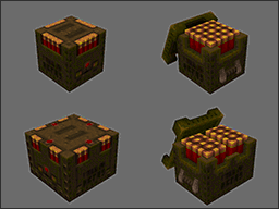
The Quake ammo items are setup in a special way using BSP entities that most engines will draw full bright and when coupled
with glowing textures ignore any environmental light settings while sticking out like a sore thumb. By converting the ammo items to
the default model format (MDL), the full bright light issue is removed and the items can fit better within any environment.
The original ammo items cannot be easily rotated because the origin of the object is at
the corner instead of the middle. Why this was left this way I will never know, but it was probably a mistake and due to limited
time and other greater problems having to be fixed first, got left and shipped. The new ammo items can be rotated to any angle
which means that the overall shape and texture details can be highlighted to the player while creating more variety to placement.
|
|
I did not want to create an item that looked completely different because Quake players already recognize the shape and it
would be better to build on that experience than throwing it all away with something new.
The original shape was just a square and pulling out all the texture detail was a good starting point for making the object more
interesting and yet still familiar. The box went through four different designs and eventually the top texture details
was turned into a separate lid model that was posed in different positions for extra detail.
|
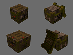
Long before I realized how subtly different the ammo sizes were ingame I would often just pick up ammo without
realizing what quantity is was beforehand. I understand now they have slight box size changes and extra texture
detail, but if they are not next to each other then that kind of detail is not easily recognized.
The new ammo designs still maintain the original texture difference but the larger ammo has a rectangular footprint and
the ammo across the top is split into two sections to suggest double the quantity available.
|
|
|
|
|
|
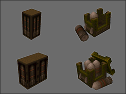
The original rocket ammo suffers the most from the boxy look with the same detailed 3D objects stamped on every flat side.
The new rocket model is the player (fired) rocket projectile with the fins cut off and painted with similar colours to the original design.
The rocket box does support a separate lid model, but the real variety comes from the single rocket being placed outside
in different positions. The rocket casing textures are different between ammo quantity types, but it is very subtle and easily missed.
|
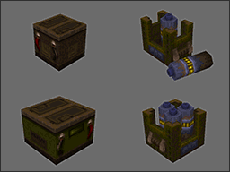
I always thought the original lightning / cell ammo shape was having an identity crisis because the rest of the ammo types are military like boxes
and this one is a giant looking car battery! I know the shape is square, but in my mind the detail pops out and makes me think not box.
It also feels very medieval and rough, which ironically fits perfectly with the Quake medieval theme,
but it losses previous ammo style recognition with the player.
The new design is about taking the rocket ammo design and using a AAA style battery cell instead. The overall shape is reduced down to a
hexagon which creates sharper edges and allows for extra top details while keeping the overall poly count down.
Most of the time was spent trying to scale the AAA battery shape up to match the rocket shape, which caused no
end of problems because for a long time it looked nothing like it was suppose too. Eventually with the right texture
detail the function of the original shape returned and the cells became consistent with the previous ammo types.
|
|
|
|
Every few months I fire up Minecraft to check out the latest updates and start a new random landscape because
usually there are new features with how the worlds are generated. As per usual I start in survival mode and spend the first
few daylight hours frantically
rushing around collecting resources and building my first makeshift shelter to survive the night.
I really like survival mode because it applies pressure to your activities and how you build
structures. There is less planning and more frantic mistakes as the foundation and side walls need to be constructed quickly
otherwise you become zombie snacks or creeper fireworks. Often new structures will have a chaotic initial layout and plenty of
alignment space issues, but this creates really good organic and interesting spaces to build and explore.

|
|
As always I fell into my typical building patterns of wizard style towers with large spiral wooden staircases,
precarious external balconies watching over the night time chaos below and an optimized enchanter library at the top.
I never like to waste vertical tower space and usually dedicate the roof top areas to various crops. I setup
pools of water, rows of freshly ploughed soil and grow specific resources; wheat, sugarcane and pumpkins. This time though
the high altitude created snow everywhere and froze all the water causing problems with maintenance.
|
Eventually I moved the crops to a lower altitude to fix the cold weather problems, but this left me with lots of empty roof
space. On the surrounding mountains I loved the look of the trees with snow on top and I wondered what it would be like to have
mini forests perched on the top of the towers touching the clouds. The random tree generating algorithms created some really
beautiful foliage designs and with the snow on top it just looked so epic.
It all started with a few fields of cows and sheep wandering around munching grass, producing leather
for books and piles of tasty steaks for my backpack while mining deep underground. Eventually after
many different upgrades to the area I had unwittingly created a
maximum security compound for cows!
My over zealous efforts to prevent spiders from getting into the area had drove me to add bars on all openings,
a large surrounding walkway and various security gates on all exits!
Those poor cows, they never saw it coming ...
|
|
|

|
|
|
|
|
|
 |
|
|
Trouble Comes in Threes |
21.Aug.2014 |
|
|
 |
|
|
|
|
|
I was always told by my family that 'trouble comes in threes' and my latest experimental Quake maps seem to be proving that point.
It all started back in March when my Dark Souls 2 Marathon was in full swing.
I was busy falling off ledges, dying to tag team boss fights and rolling my eyes as 'special' scripted monsters were one shot killing me.
After a month of shouting at my TV and smashing my controller into the ground, I was ready to get back to mapping.
It is never easy mashing together different game play styles and hoping something sticks. I wanted to play
with the Dark Souls 2 mechanics, I wanted to fear falling, have route choices and most of all, I wanted my actions to
have consequences. I knew taking some of these game play ideas and forcing them into Quake was going to be frustrating for
some people, but I wanted to see if Dark Souls 2 game play mechanics are portable.
After the release of The Horde of Zendar many people said it was my best work to date and that
unfortunately means people expect more of the same. There is only one direction you can go once you have climbed a mountain and that
is down. With the experience of Dark Souls 2 fresh in my mind I knew this was my chance to do some experimenting
and see if the Quake community shared my enthusiasm or would be reserved with their feedback instead.
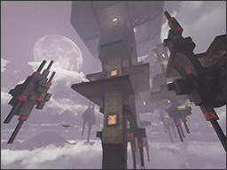
Metal Monstrosity was an experiment about the fear of falling. The map had
limited floor space, unforgiving AI and a deadly flailing arms dance with gravity when you try too many leaps of faith.
The map was loved for its look and style, but was down voted
back to the stone age. Unfortunately hardly anyone left comments saying why, but
I suspect the combination of Quake player speed, small floor footprint and the lack of safety railings was just too much.
|
|
Metal Monstrosity is a series of platforms floating high up in the clouds powered by ancient red runes,
battered by howling winds and silently waiting for players to take the wrong step off the precarious ledges.
A giant hodgepodge of metal and runic stone with no outside walls and hardly any doorways or connecting corridors.
Metal Monstrosity is a shattered jigsaw puzzle of platforms stitched together via a series
of light energy bridges that gradually unlock new routes and perfectly tie up loose ends back from secret locations.
|
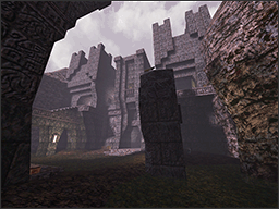
Castle of Kaahoo was a quick speedmap experiment about route choices.
The release was part of a map pack and my over zealous use of map models caused problems with other entries.
I said I would release my map later and spend more time expanding it into full release,
but people just kept posting links to the old version and it
reminded me of the Streisand effect.
The more I told people to stop posting links, the more that would appear, eventually I just gave up and abandoned the map.
The Castle of Kaahoo was the result of a three day mapping session using large amounts of
monolithic bricks, a sprinkle of vertical player progression experiments and a giant festering bucket of swamp water.
The front facade of the castle
was designed to be a visual wow moment first followed by a gentle introduction to combat.
The greatest mistake for any map designer is to overwhelm the player at the beginning, it is easy to forget that the
player is new to the environment and the map designer knows every detail.
|
|
|
|
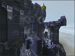
One Thousand Cuts was an experiment about consequences and how the
players actions could affect their choices. This was the least liked of all three maps and probably the worst match
for Quake gameplay because it restricted exploration and compartmentalized the level. The player also had no satisfaction
of completion at the end of the map and often felt like something was missing.
|
|
One Thousand Cuts was my homage to the beautifully cold and chilling colour palette
made by Iikka Keränen. The texture set was expanded in all directions with
new arch designs, seamless lattice patterns and way too many different door designs and sizes!
With so much blue in all directions the flow of the map
suffered from a very rigid design philosophy to help prevent the player getting lost.
The path infront and behind the player was dynamically changed based on their actions, but ultimately made the map too linear.
|
One of the things I really love about Quake is the use of projectile weapons and how the player (with skill) can dodge
all kinds of damage without the need of the clumsy modern day equivalent 'hide behind cover' mechanic all of the time.
Allowing the player the ability to dodge really plays to the strength of FPS
and rewards players who learn to keep moving around.
The Quake shotgun is an instant hitscan weapon with a crazy long range and minimal amount of bullet spread that is so good
it is often used as a sniper rifle. I have always wondered what it would be like to fire the shotgun with actual projectiles
and after a little bit of QC scripting I got to see a cloud of buckshot hit multiple targets in game and it was powerful.
The shotgun felt like a new weapon, maybe it was seeing the kinetic energy of so many projectiles hit multiple targets at once,
not sure exactly, but the damage output was not changed.
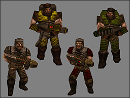
The Quake Grunt uses the shotgun and in large packs they can be annoying because the weapon is instantaneous and
does not give any obvious hint of what direction it is fired from. I have often wondered what it would be like to see
enemies firing a projectile shotgun and I was surprised it looked so good.
I setup a Quoth like squad of enemy units using all projectile weapons, lowered their health bars,
allowed damage to accumulate past zero and the double barrel shotgun up close just became an instant gib
making machine that made me grin from ear to ear!
|
|
|
|
|
|
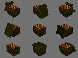
With my new found love of the Quake shotgun and double barrel gib-a-nator I thought it was about time the ammo boxes got a proper
visual upgrade. With lots of extra model / skin details, a removable lid that could be posed in different positions
and a randomly spawning rotation angle, the box of shells just screamed for the players attention.
Unfortunately this projectile experiment was pushed to the back burners as other projects needed my time and attention. It certainly was
surprising to see how much different a typical hitscan weapon can feel like when it is converted to projectiles instead.
|
|
|
|
|
|
 |
|
|
The Retro Dream Bus |
08.Feb.2014 |
|
|
 |
|
|
|
|
|
My journey through the land of Quake started late one night with some crazy looking brushwork doodles and eventually finished with
my favourite map to date, The Horde of Zendar.
I have always thought of Quake as a treasured favourite from my past and
I remember when it first came out, I was blown away by the game having true 3D levels that I could walk around. Even thou that sounds
crazy by todays game standards, at the time it was ground breaking!
Quake is an unique experience, there really is not much else like it, the game is dripping in blood soaked pixels, full of nightmarish
monsters and has very aggressive game play mechanics. The environmental styles
range from typical tech style base designs to surreal elder world castles soaked in black shadows. Unfortunately the monsters
were as dumb as bricks and they would often run straight at you, guns ablazing, swords a swinging and claws a tearing.
The game had its own kind of intensity, there were no rooms full of enemies like in Doom, but instead the monsters were setup in
ambushes. They could be high up on ledges raining down grenades or silently drifting in the darkness
waiting to surprise you with a hiss and acid spit and if you are not careful leaping at you with teeth and claws
at the ready. The game was driven by terror and surprise, panic and dread and the fear of what lies around the next corner.
|
|
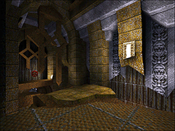
Midnight Stalker was inspired by vivid dreams of blue elder worlds and warped brushwork, a
twisted metal underground lair of monsters and contraptions waiting for some unwelcome fool to wander into.
The environment was designed to slide apart like giant pieces of a puzzle, to change as the player progresses and the monsters were placed
in positions of strength. This is a map full of environmental hazards, unusual monster ambushes and traps
for both the player and monster to be caught out by.
|
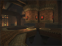
Backsteingotik was a towering monolith of bricks stretching upwards into darkness.
There are no fancy archways, fine details,
or environmental set pieces, just a mountain of bricks. The map is based on a central hub system
where the player unlocks various parts of the map over time while returning to one point for multiple encounters.
The game play is a mixture of ambushes and special arenas where the player can operate crushers to inflict upon
unsuspecting monsters. Many of the areas are revisited several times from different
heights and there are plenty of secret areas to unlock and explore.
|
|
|
|
|
|
The Ivory Tower is based on a story, a world full of details stacked up over time,
a place where each corner is designed with a purpose. The player will experience
brightly lit chapels, large underground caves stitched together by elevator shafts and will be unconsciously led
by rusty tracks laden with carts full of gold.
The game play is different, there are plenty of empty encounter spaces, opportunities to look around and explore.
There are many locations presented from multiple directions to give the player the sense of space and show where they are going to be next.
|
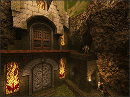
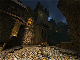
The Horde of Zendar is designed to be played forward or backwards and still make sense.
The map is about player choices, multiple routes and plenty of secret areas waiting to be unlocked
via multiple silver keys. The objective is simple, escape the city, but there are so many secret places to explore as well.
The game play is classic ambushes tailored to each area of the map with plenty of vertical situations to keep the player looking up.
The central hub is visited on many occasions and the climax to the story is when the final battle is over the floor is
littered with the fallen bodies of the Horde of
Zendar
while the player escapes to tell the tale.
|
|
|
|
|
|
|
|
|
 |
|
|
|


