|
|

|
|
All use of my digital work is covered by this
Creative Commons Deed.
Please do not use any of my work for commercial purposes, thank you. |
|
|
|
|
Phong Shading
|

|
|

|
|
|
|
|
 |
|
|
|
Phong shading is all about creating the illusion of more detail from less. By reducing the
contrasting light differences across triangle edges, the exact outline of the brushwork is hidden by
soft shadows. This gives the player the impression of more detail when there is actually less.
This method of shading is best used across organic materials because it can creates such soft edges.
Phong shading relies heavily on a good detailed texture for shape and form because there are no hard
edges.
This article will hopefully show you what Phong shading is all about and how to use it to its best
advantage. Luckily Phong shading is easy to implement and experiment with and when used with the appropriate
brushwork it can produce some spectacular results.
For those of you that are interested in mathematics and like to know how things work then I recommend
looking at the following articles on Phong Shading and
Phong Lighting. There is a
difference between Phong Shading and Lighting and both articles show this in greater detail.
|
|
|
|
|
|
 |
|
|
|
|
Out of the rough into the smooth
|
|
|
|
|
|
|
|
 |
|
|
|
 |
|
Trying to represent something organic can be difficult. Organic materials by their very nature are
complex and simply require far too many brushes / triangles to be represented realistically.
To solve this problem, first find a realistic looking texture which can be used to represent
the fine detail. It should not repeat too badly and be interesting enough to present
the impression of the correct material.
Next create a low detail mesh or collection of brushes which have enough variety in their overall
shape to give a reasonable impression of something organic. Straight lines and axial
constructions are not organic looking and should be avoided.
|
|
|
|
|
 |
|
|
|
|
|
|
 |
|
|
|
 |
|
Once all the brushwork has been created and the correct texture has been chosen it's time
to light the test brushwork and see how it looks.
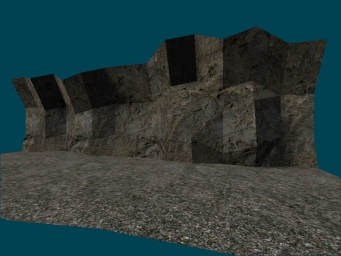
Use a single light source and compile the test brushwork using a box map. The test brushwork
may look similar to the image above with hard light edges, high contrasting shadows and a
generally unrealistic appearance
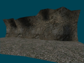
But all is not lost, because with the aid of Phong Shading the brushwork can be made to look
like that in the image to the left, with smooth looking shapes and diffuse shadows
complimenting the irregular brushwork underneath
|
|
|
|
|
 |
|
|
|
|


